All — Behind the Brand — Famous logos — News — Travels — Useful

Blue — why this colour is the most trusted choice in branding?
Blue is the world’s most widely used branding colour. From IBM and Samsung to Nivea and IKEA, discover why it symbolises trust, professionalism, and innovation across industries.

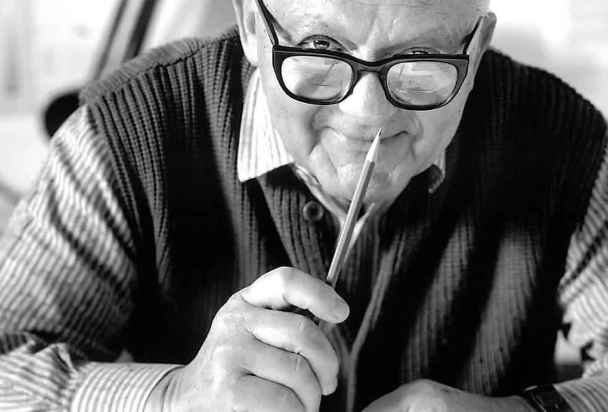
Famous logos: Part XX — Otl Aicher
Otl Aicher was born in Ulm, Germany, in 1922. Growing up in a politically turbulent time, he refused to join the Hitler Youth and even spent part of his youth in hiding. After the war, he studied sculpture and design at the Academy of Fine Arts in Munich, but his most important contribution would come not from his formal education but from his vision of design as a tool to rebuild and reimagine society.
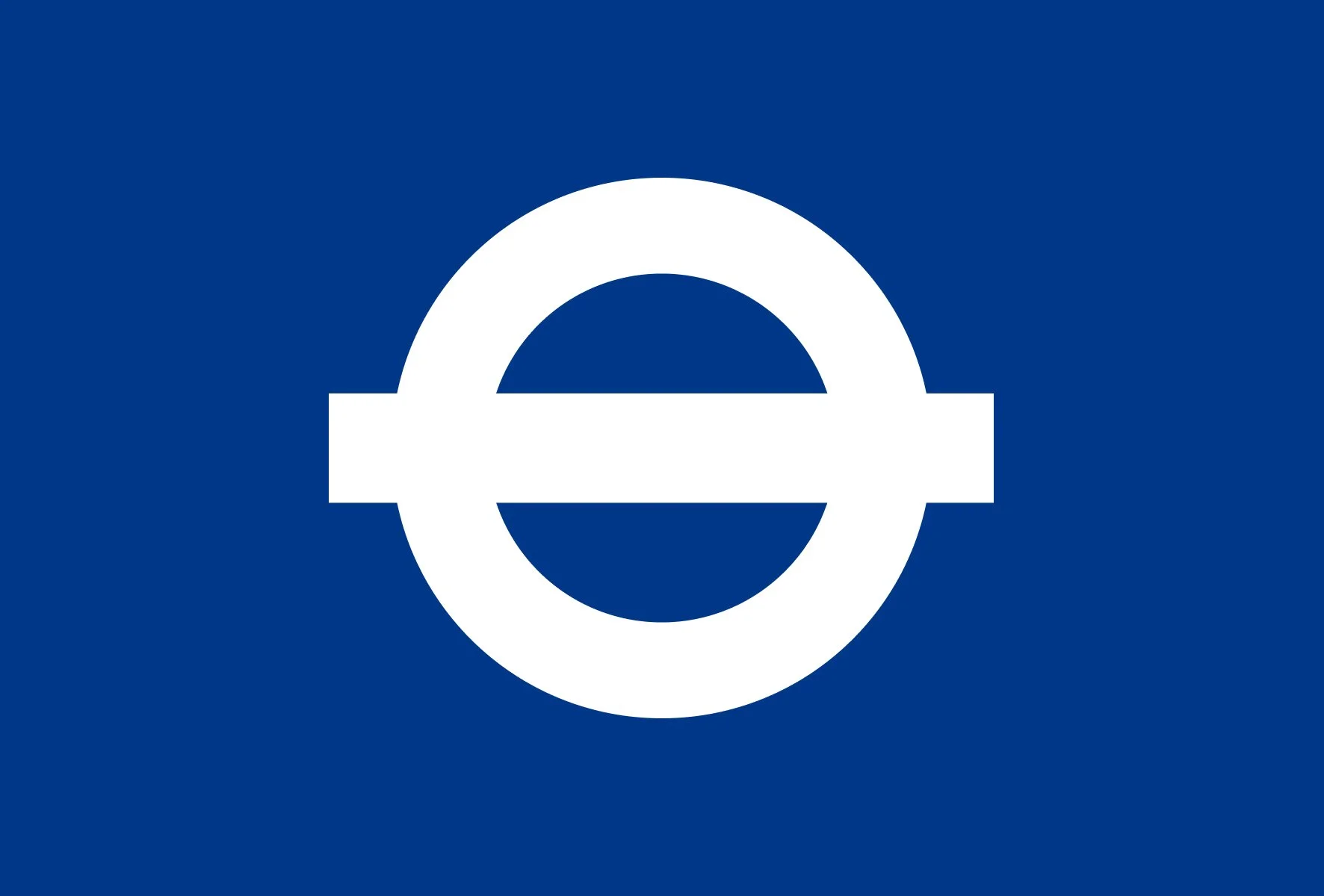
Famous Logos: Part XIX — Transport for London
When we consider the world’s most recognisable logos, corporate giants like Coca-Cola or Apple often spring to mind. Yet, some of the most influential symbols emerge not from boardrooms, but from the streets — clear, functional, and embedded in daily life. Few logos exemplify this better than London’s iconic roundel, the emblem of public transport that has silently shaped the city’s identity for over a century.
The evolving design market: navigating challenges and opportunities
The design industry is experiencing profound changes. For decades, traditional design studios have operated with stable processes, long project cycles, and well-established client relationships. These methods, while reliable in the past, are increasingly challenged by a market that demands speed, flexibility, and adaptive solutions. Clients now expect agile responses to evolving business needs, tighter deadlines, and solutions that integrate seamlessly with their strategic objectives. This shift has created a landscape where smaller studios and freelance designers can compete effectively, offering nimble, focused services that larger, more rigid studios often struggle to provide.

Why typography matters in visual identity?
Typography is more than just letters on a page — it's a fundamental element that shapes how a brand is perceived. It sets the tone, communicates values, and ensures consistency across all visual outputs. A strong typographic system not only looks good — it speaks directly to the audience.
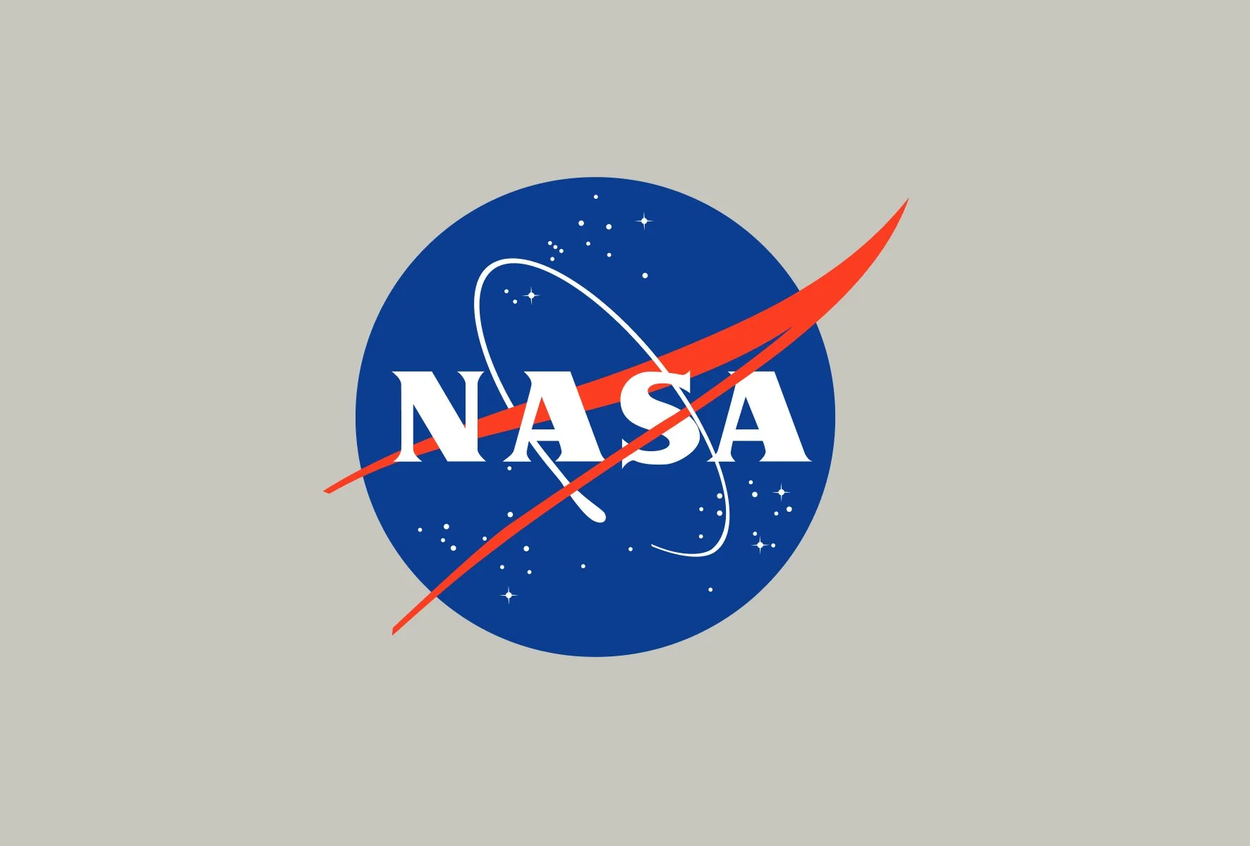
Famous Logos: Part XVIII — NASA
When we think of iconic logos, few reach the stratospheric recognition of NASA. Founded in 1958, the National Aeronautics and Space Administration quickly became a symbol not just of American innovation, but of humanity's quest to explore the unknown. Its visual identity has evolved alongside its missions, capturing shifts in technology, public sentiment, and even political context.

The ABC of a design brief

Famous logos XVII — Switzerland
Switzerland is one of the few countries that has successfully built a strong and cohesive national visual identity. While many nations have flags and symbols that evoke their heritage, Switzerland took this a step further, creating a branding system that is instantly recognisable worldwide. The red-and-white colour scheme and the Swiss cross are more than just national symbols — they are hallmarks of quality, precision, and reliability. Unlike most other countries, Switzerland’s approach to a national identity was a deliberate effort, formalised in the mid-20th century. The Swiss Federal Council played a role in standardising the use of the Swiss cross, and designers from the renowned Swiss school of graphic design helped shape the country's visual narrative.

Behind the brand — Leanest
Leanest is an Estonian IT company founded in 2016 by a team with extensive experience in software development and IT. Our core business is software development — through our software solutions and innovative technologies, we help clients take their business to the next level by increasing process efficiency and automation. Our activities can be divided into three key areas: production optimisation solutions (IME 5.0, MES), workforce planning solution Stafflogic, and AI-based automated quality control solutions for production industries (e.g., woodworking).

Famous logos XVI — Formula 1
In 2025, Formula 1 celebrates its 75th anniversary—marking three-quarters of a century as the world’s premier motorsport series. Since its first official season in 1950, F1 has been the pinnacle of speed, technology, and competition. But alongside the evolution of the cars, circuits, and champions, its visual identity has also transformed, shaping how the sport is perceived by fans and sponsors alike.
Famous logos XV — Paul Rand
Rand was heavily influenced by the European modernist movements, including the Bauhaus, Constructivism, and De Stijl. He admired designers like Jan Tschichold, El Lissitzky, and László Moholy-Nagy, whose work focused on clean, functional, and structured design. Rand’s approach to branding and logo design was rooted in simplicity, clarity, and the belief that “Design is so simple, that’s why it is so complicated.”

Summary of the 2024
Another year has passed, again filled with loads of awesome projects on a “usual” wide variety of creative level. Hope you’ll enjoy the showcase.

Pantone’s Colour of the Year 2025 - Mocha Mousse
Pantone’s Colour of the Year 2025: Mocha Mousse – A Warm Embrace of Timeless Elegance
Every year, the announcement of Pantone’s Colour of the Year sets the tone for design, fashion, and cultural aesthetics. For 2025, Pantone has unveiled Mocha Mousse as the defining hue of the year — a rich, velvety brown with warm undertones that evoke comfort, sophistication, and a sense of groundedness.

Famous logos XIV — LEGO
The Story of the LEGO Logo – From Natural Wooden Blocks to One of the World’s Most Recognizable Brands

Visual identity guidebook — online
Moving various assets online is no longer news, but in our daily work, we often see that a company’s style guide still exists only as a document on someone’s computer or in a cloud service. Over time, finding the necessary files for creating other media can become difficult, and sharing them with new employees or partners can be a hassle.

Expand your business horizon — franchise
Franchising as a business model has existed for centuries, but its modern concept began to take shape in the 19th century in the United States. One of the first companies to adopt the franchise model was Singer Sewing Machine Company, which started expanding its after-sales services through franchise agreements. Since then, this business model has spread across various industries, from fast food to hospitality and service provision.

Famous logos XIII – Apple
Apple visual identity has undergone several changes, each reflecting significant milestones in the company’s history and product development.

Famous logos XII — BMW

Summary of the 2023
Once again, it's time for summaries, and we take a look back at our twenty-third year, where the tone was set by several collaborative projects, a variety of web solutions of different scales, and a multitude of diverse online graphics.

Pantone's Color of the Year 2024 — Peach Fuzz
In the ever-evolving world of design, colors play a pivotal role in shaping trends and influencing creative expressions. Pantone, the global color authority, has once again cast its gaze upon the palette of possibilities and declared the Color of the Year for 2024 — meet Peach Fuzz.