Famous logos XV — Paul Rand
Early life and education
Paul Rand was born as Peretz Rosenbaum in Brooklyn, New York, in 1914. Raised in a Jewish immigrant family, Rand’s early exposure to design came through painting signs for his father’s grocery store. He later studied at the Pratt Institute, Parsons School of Design, and the Art Students League in New York. However, Rand often commented that his formal education was not the most significant influence on his work; he believed that experience and self-education were far more valuable.
Influences and design philosophy
Rand was heavily influenced by the European modernist movements, including the Bauhaus, Constructivism, and De Stijl. He admired designers like Jan Tschichold, El Lissitzky, and László Moholy-Nagy, whose work focused on clean, functional, and structured design. Rand’s approach to branding and logo design was rooted in simplicity, clarity, and the belief that “Design is so simple, that’s why it is so complicated.”
Breakthrough in editorial design
Rand gained recognition in the 1930s and 1940s by designing covers for Esquire and Apparel Arts magazines. His ability to mix photography, illustration, and typography in a dynamic and playful manner set him apart. By the mid-1940s, he became the art director for the advertising agency William H. Weintraub & Co., where he revolutionised corporate advertising by integrating modernist principles into commercial design.
Paul Rand’s most iconic works and their impact
Paul Rand’s approach to logo design was revolutionary for its time. Instead of treating logos as decorative elements, he saw them as essential components of a brand’s identity. His designs were simple, memorable, and built to stand the test of time. Let’s take a closer look at some of his most significant contributions to corporate identity.
Legacy and impact on design
Rand’s work set the foundation for modern branding. His emphasis on the relationship between form and function, as well as his belief that a logo must be simple yet powerful, continues to influence designers worldwide. His books, including A Designer’s Art and Design, Form, and Chaos, remain essential reading for graphic designers.
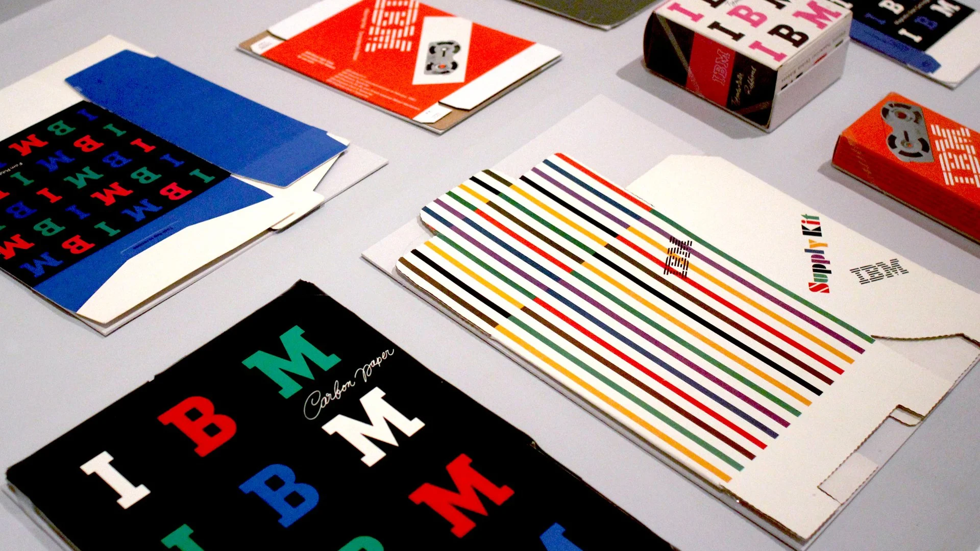
IBM (1956, 1972) – Iconic branding for a technology giant
By the 1950s, IBM was already a major player in the technology industry, but its branding did not fully reflect its innovative and forward-thinking nature. When Paul Rand was hired to redesign IBM’s visual identity, he first introduced a simple, bold serif logotype in 1956. This design was already a significant improvement over the company’s previous emblems, giving IBM a modern and authoritative look.
However, Rand didn’t stop there. In 1972, he refined the IBM logo further by introducing horizontal stripes. These stripes symbolised dynamism and speed while also visually representing data transmission and the digital nature of IBM’s business. This striped logo quickly became one of the most recognisable symbols in the tech industry and remains central to IBM’s identity today.
ABC (1962) – Minimalism in media branding
When ABC (American Broadcasting Company) needed a new logo in the early 1960s, television was overtaking radio as the dominant medium. Rand designed a lowercase, sans-serif logotype enclosed in a black circle. The simplicity of the design made it adaptable across different platforms, from television screens to print media.
What made the ABC logo remarkable was its timelessness — it has remained largely unchanged since 1962, proving that a well-designed logo does not need frequent updates.
UPS (1961) – A modernist rethinking of package delivery
Before Rand redesigned the United Parcel Service (UPS) logo in 1961, the company’s identity was outdated and overly ornate, featuring an eagle carrying a package. Rand simplified it dramatically, replacing it with a clean, modern shield and the image of a tied-up parcel—a clever visual shorthand for the company’s core service.
For decades, this logo was a symbol of reliability and efficiency. It remained in use until 2003 when UPS controversially replaced it with a more gradient-heavy design. The change was widely criticised, as it lacked the timeless strength of Rand’s original.
Westinghouse (1960) – Engineering simplicity into a logo
For Westinghouse, an American electronics and engineering giant, Rand created a bold, minimalist “W” mark that integrated dots and lines to symbolise electrical circuits. It was a perfect example of his belief that a logo should not just represent a company but reflect its industry.
This design was one of Rand’s most structural and mathematical logos. It demonstrated that branding could be both abstract and deeply meaningful. In 2023, Pentagram Design Agency made a rebranding focussing mainly to typography and widened the design system while keeping the iconic logo mark as it has been from sixties.
NeXT (1986) – Designing for Steve Jobs
One of Rand’s last major projects was the NeXT logo for Steve Jobs’ post-Apple venture. This project was unique because Rand did not just present a single logo — he delivered a full 100-page presentation book explaining its rationale. Jobs remarked that Rand was the only designer he worked with who didn’t offer multiple options.
The NeXT logo used a simple black cube with the word “NeXT” in a colourful, playful arrangement. This contrast between geometric precision and informal typography reflected the company’s balance between high-tech innovation and creativity. Jobs later called Rand “the greatest living graphic designer.”
NeXTcube, top, front, and back sides; each side is exactly 12”x12”; image Inexhibit.
Paul Rand’s lasting legacy
Rand’s work reshaped corporate identity, proving that logos should not just be visually appealing but also conceptually strong. His minimalist approach remains the foundation of modern branding, influencing generations of designers. Today, his principles — clarity, simplicity, and strategic thinking — are more relevant than ever in an era of digital-first branding.
As Rand himself put it: “A logo doesn’t sell (directly), it identifies.” This simple yet profound insight remains one of the core principles of branding to this day.


