Famous logos XVI — Formula 1
75 years of speed, innovation, and identity
In 2025, Formula 1 celebrates its 75th anniversary — marking three-quarters of a century as the world’s premier motorsport series. Since its first official season in 1950, F1 has been the pinnacle of speed, technology, and competition. But alongside the evolution of the cars, circuits, and champions, its visual identity has also transformed, shaping how the sport is perceived by fans and sponsors alike.
From the classic “F1” logotypes of the early years to the dynamic “Flying 1” design (1994–2017) and today’s minimalist and digital-first approach, Formula 1’s logos reflect both the sport’s legacy and its future. But who were the designers behind these changes? And how did each version of the F1 logo capture the essence of speed, power, and prestige?
1950–1980: The early years and simple logotypes
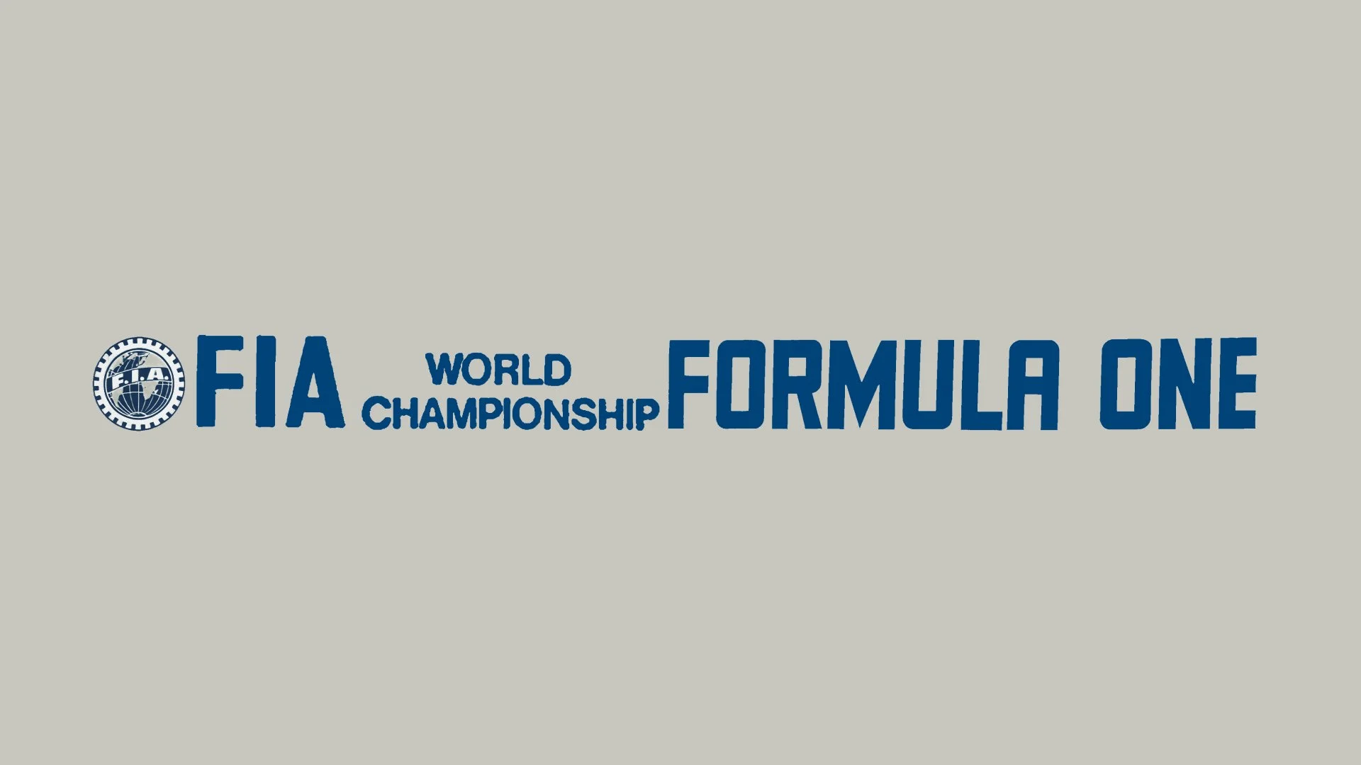
In the early decades of Formula 1, there was no single unified logo. Instead, various simple F1 wordmarks were used in programmes, race promotions, and FIA documents. The typography varied from year to year, and in some cases, races used their own distinct branding rather than a centralised Formula 1 identity.
1980–1993: Establishing an official F1 brand
By the 1980s, Formula 1 had grown into a truly global sport with a massive commercial presence. The first official F1 logo emerged during this period, featuring a simple “F1” in bold, blocky lettering with a checkered flag incorporated into the design.
1994–2017: The iconic “Flying 1” logo by Carter Wong Design
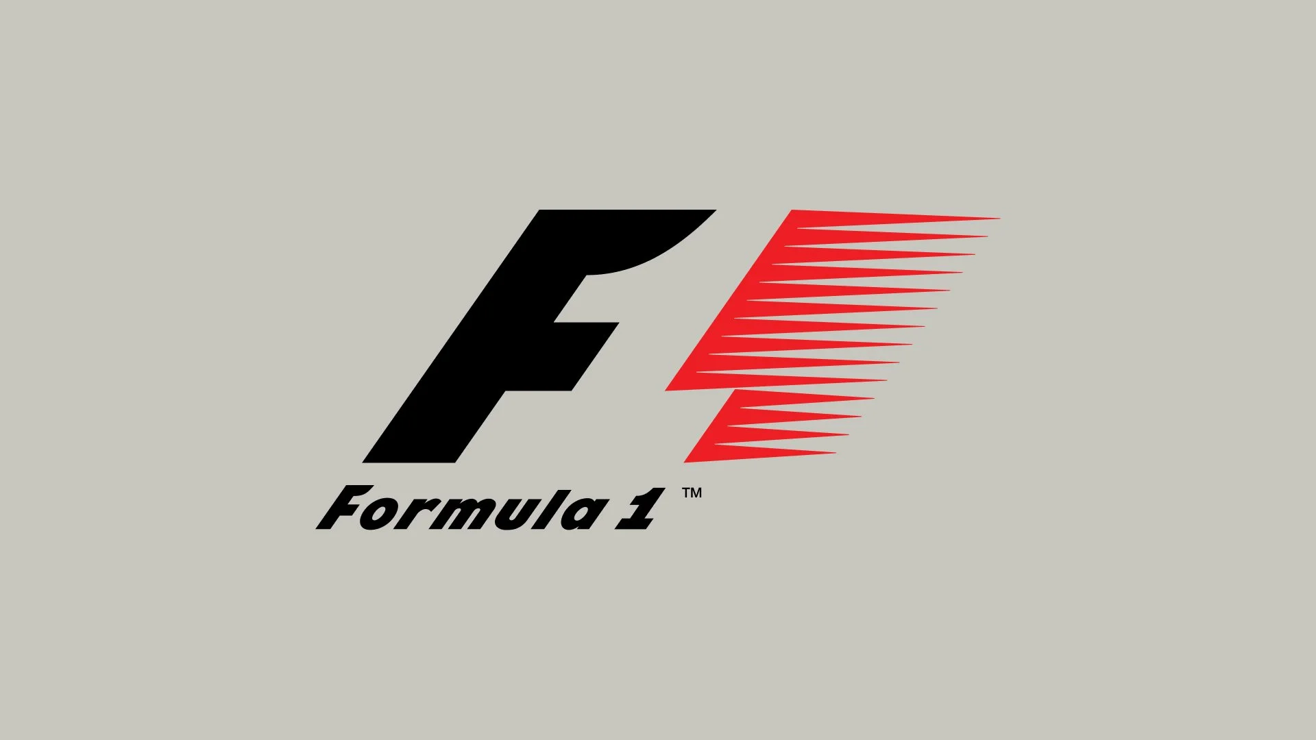
Perhaps the most recognisable and beloved version of the Formula 1 logo was introduced in 1994. Designed by Carter Wong Design, this version featured a sleek “F” followed by a red speed-driven “1,” which cleverly used negative space to suggest movement. The elongated, italicised form gave the impression of high-speed motion, making it a perfect fit for the sport.
This version of the logo became the longest-running official logo (used for 23 years), featured on all official F1 broadcasts, team uniforms, and merchandise and it was Instantly recognisable by motorsport fans around the world.
This logo perfectly captured the essence of F1: speed, elegance, and innovation. For over two decades, it remained the face of the sport, until a major rebrand changed everything in 2017.
2017–present: The modern and digital-first logo by Wieden+Kennedy
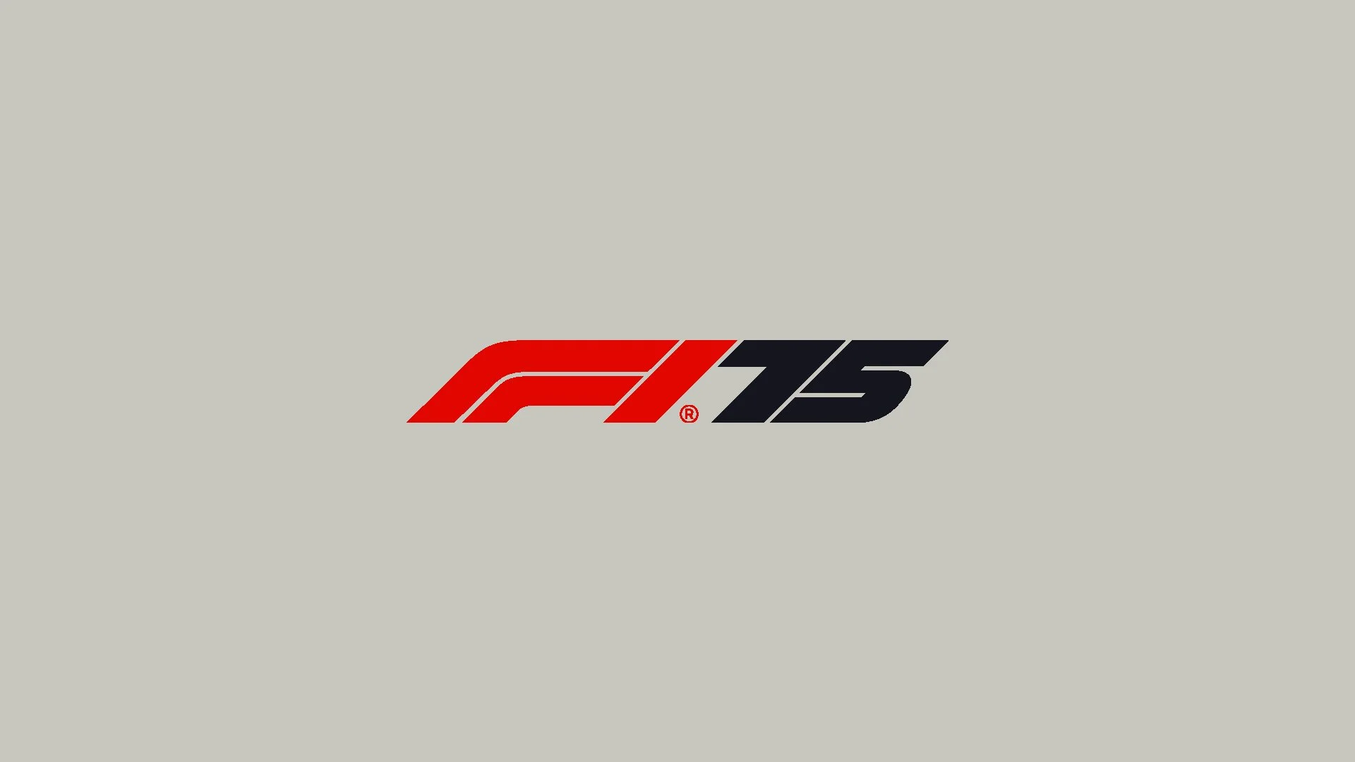
After Liberty Media took control of Formula 1 in 2017, they sought to create a fresh, modern identity that reflected the sport’s new era of digital engagement. This led to a full rebranding effort, with Wieden+Kennedy London designing a new, minimalist F1 logo.
The logo was officially introduced at the 2017 Abu Dhabi Grand Prix and it became a major part of Liberty Media’s branding overhaul, seen in all digital and on-screen elements, making it more versatile for modern media.
While some fans initially resisted the change (preferring the iconic 1994–2017 logo), the new design has proven to be highly adaptable in the digital age. It aligns with the clean, minimalist branding trends of today while still conveying speed, movement, and modernity.
The new identity extended beyond the logo, incorporating a custom typography system designed by French type designer Marc Rouault. This bespoke typeface family included three core variations: F1 Regular – a clean, modern typeface for general use. F1 Turbo – a bold and wide typeface for impactful headlines. F1 Torque – an italicized, high-speed-inspired version adding a sense of motion.
Developed in collaboration with designers Richard Turley, Luke Timothy, and Sean Rees, this typographic system reinforced Formula 1’s dynamic and cutting-edge image. The fonts became a crucial part of F1’s branding, appearing across broadcast graphics, trackside signage, official merchandise, and digital platforms.
By integrating a distinct and cohesive visual language, the 2017 rebrand successfully positioned Formula 1 for the modern era, ensuring consistency across all touchpoints while embracing the sport’s legacy of speed and innovation.
75 years of visual identity in Formula 1
From simple typographic logotypes to one of the most iconic racing logos in history, Formula 1’s branding has constantly evolved alongside the sport itself. The 1994–2017 “Flying 1” design remains a fan favourite, but the modern Wieden+Kennedy logo is shaping the next generation of the sport’s identity.
As F1 enters its 75th anniversary season, the sport remains at the cutting edge—not just in racing technology, but also in branding, marketing, and global appeal.


